

A logo that earns its place on the shopfront
A logo has to hold up at twenty metres on a shopfront, at sixteen pixels in a browser tab, and stitched in one colour into a polo shirt. Most of the marks I am asked to replace fail at least one of those, and the owner only finds out when the signwriter sends back a quote.
This page covers custom logo design Melbourne health, fitness and wellness businesses can actually use: how it gets made, what lands in your hands, and what it costs. I am Steve, and at Steve's Creative Space you deal with the person doing the design, start to finish.
Prices are published, not gated. Foundation starts at $3,500 and is delivered in four weeks, with Transform at $7,950 and Empire at $10,450 for multi-location businesses. Below: what you receive, the eight kinds of logo, how a mark is tested, what ownership and trade marking really mean, and what moves a project from $3,500 to $10,450.
What you actually receive
Every logo design Melbourne project here delivers this list, and every item exists because something in the real world demands it.
● Primary logo. The definitive version, used anywhere there is room to use it properly.
● Horizontal lockup. For website headers, email signatures and letterheads, where height is scarce and width is not.
● Stacked lockup. For square and tall spaces: social profiles, signage panels, uniform chest placement.
● Submark or icon. The compressed version for a stamp, a sticker or a social avatar.
● Favicon. Built and tested at sixteen pixels, because the primary mark turns to mud at that size.
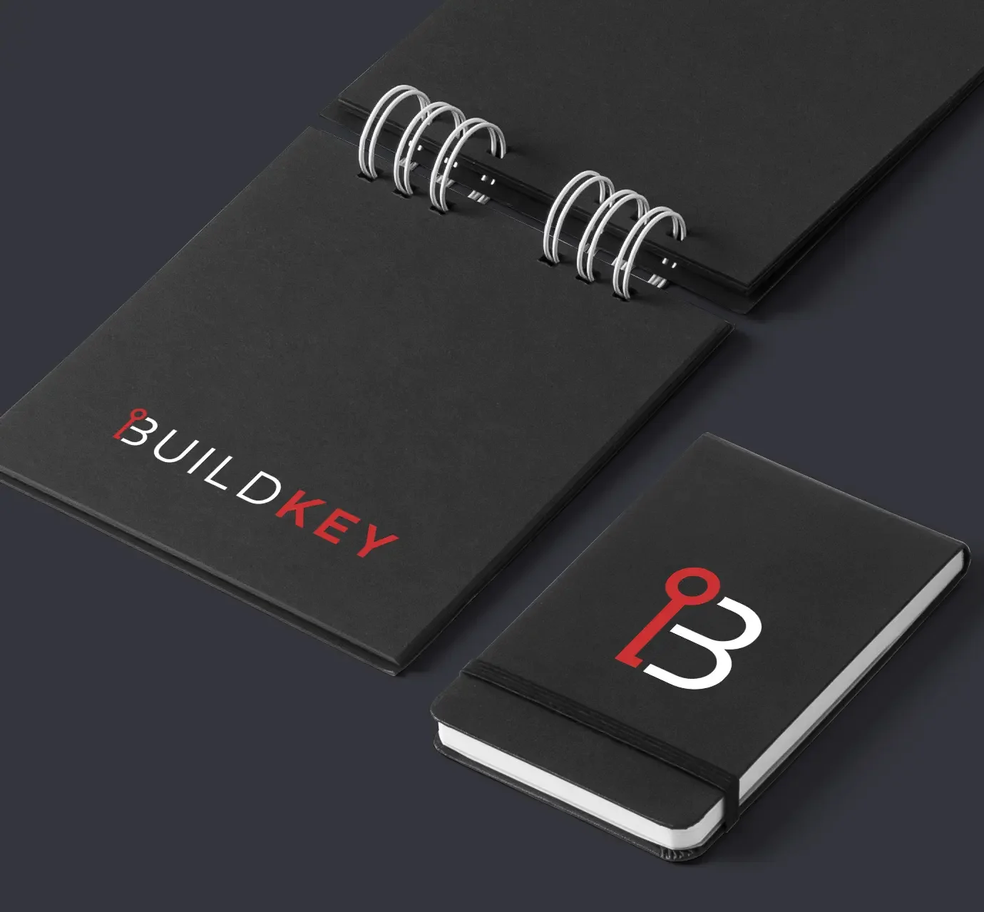
● One-colour version. For embroidery, engraving, stamps and any supplier who charges per colour.
● Reversed version. Tuned for dark backgrounds, where a mark drawn on white often closes up.
● Colour palette with HEX, RGB and CMYK values. HEX for web builds, RGB for screen and video, CMYK for print. Handing a printer a HEX code is how brand colour drifts.
● Typography system with a fallback. A display face, a working face, and a system fallback for email, forms and platforms that will not load your licensed font.
● AI and EPS vector source. The editable masters. Whoever you work with next needs these, and without them your logo is only a picture of a logo.
● SVG. Sharp at any size on the web, light in weight, and colour editable for dark mode.
● PDF. What signwriters, printers and uniform suppliers ask for first.
● PNG with transparency and JPG. For slide decks, directories, marketplaces and anything that will not take a vector.
● Brand guidelines document. Usage, clear space, minimum sizes, approved colour pairings and a list of what not to do. It exists so the tenth person to touch your logo treats it the way the first did.
Everything arrives in one organised folder, named so you can find the right file under pressure.

The eight kinds of logo, and which one your business needs.
Most quotes skip this conversation, which is how a business ends up with an emblem it cannot put on a uniform. Eight types come up in practice, each with a trade-off.
Wordmark. The business name drawn as the mark itself. Suits a short, distinctive name that can carry recognition alone. Limitation: it needs a submark, because a wordmark cannot fill a square avatar.
Lettermark. The initials, treated as the mark. Suits long or multi-word names, such as a multi-practitioner clinic. Limitation: initials describe nothing, and three letters collide with other businesses more often than owners expect.
Monogram. Letters interlocked into one considered shape. Suits a practice trading under a founder's name. Limitation: the overlaps that make it handsome are the first thing to fill in when it is embroidered.
Pictorial mark. A recognisable object drawn simply. Suits a business with one ownable, literal idea worth claiming. Limitation: it commits you, and if the offer broadens the picture argues with the new positioning.
Abstract mark. A geometric form that suggests rather than depicts. Suits clinics and studios wanting to signal movement or care without drawing a body part. Limitation: it means nothing on day one, and you pay for the exposure that gives it meaning.
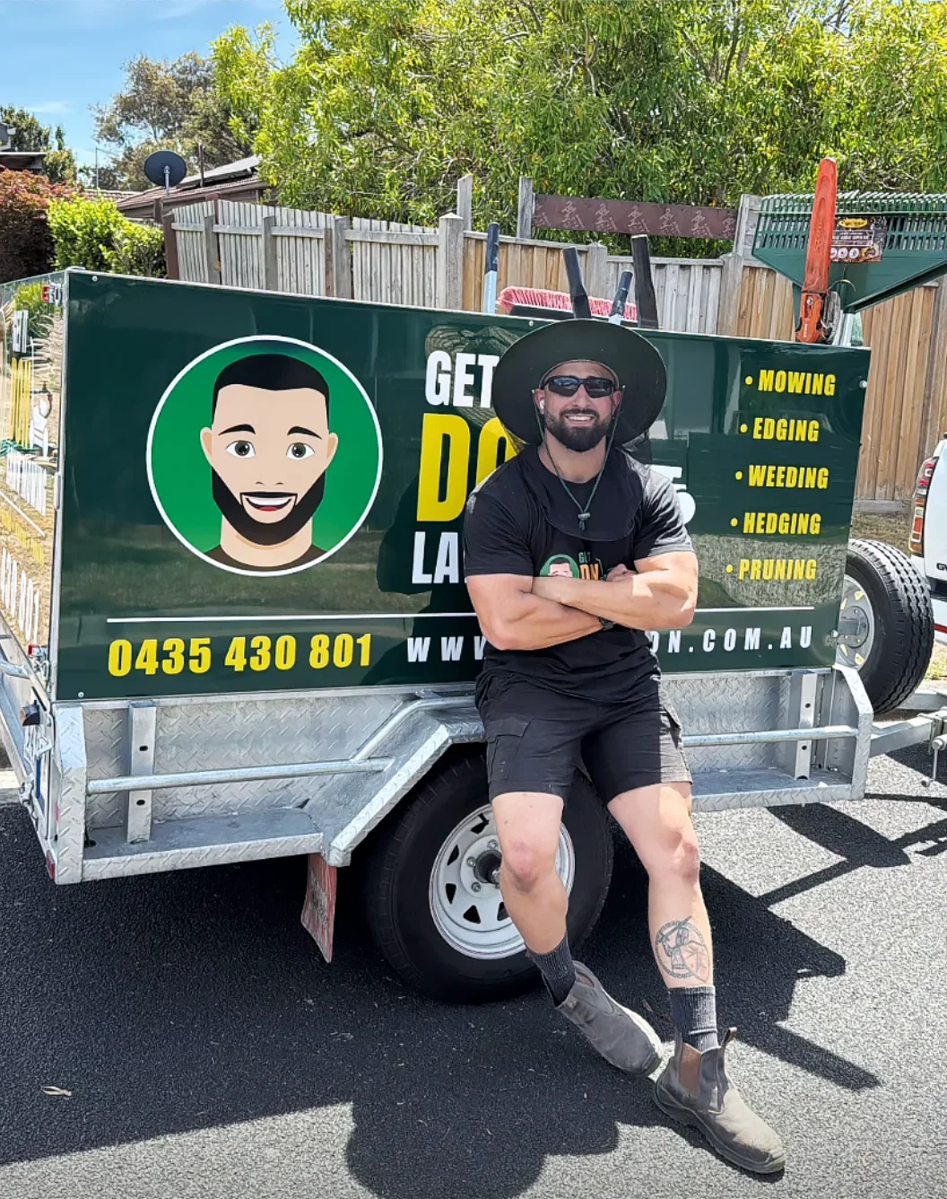
Mascot. An illustrated character with a personality. Suits children's programmes, sports clubs and gyms built on a loud identity. Limitation: expensive to reproduce well, quick to date, and it rarely survives one colour.
Combination mark. Name and symbol designed to work locked together and apart. Suits most growing businesses: a full mark for signage, a symbol for everything small. Limitation: two elements have to be excellent, not one.
Emblem. Type locked inside a shape, crest style. Suits gyms, clubs and product labels where the mark reads as a badge. Limitation: it does not reduce. An emblem that looks strong on a wall is a smudge as a favicon.
The choice comes down to three practical things rather than taste. The name, because its length pushes you towards a lettermark or a combination mark. How the business is found, because signage rewards simple high-contrast shapes while search rewards a legible name. And where the mark has to live, because embroidery, vehicle livery and app icons eliminate several types before the first sketch.
How a logo gets stress tested before you ever see it
A concept is not finished when it looks good on a white slide. It is finished when it survives the places your business will put it. Every route I present has been through these.
One colour. Flattened to solid black and solid white. A mark relying on a gradient, a tint or two tones side by side collapses here, and so does every stamp and engraving.
Reversed out of dark. Thin strokes thicken optically and small gaps close. A mark that reverses badly looks muddy and slightly wrong, and nobody can say why.
Favicon at sixteen pixels. The smallest honest test there is. A submark that fails in a browser tab fails as an app icon and a map pin too.
Embroidery on a uniform. Needles cannot render hairlines. Detail fills in, tight counters close, and text under about five millimetres turns into a caterpillar. Clinics and gyms put staff in uniform, so this matters.
Routed or cut for signage. A cut shape has no floating parts. Anything relying on an island or an unconnected element needs a redraw, better now than at fabrication.
On a vehicle at speed. A mobile physio or a clinic car gets about two seconds. Contrast and silhouette do the work. Fine linework does nothing.
Dark mode. App interfaces and email clients invert backgrounds without asking. A mark carrying a fixed white box announces itself as an afterthought.
One spot colour on cheap stock, then photocopied. Ink spreads and detail closes. Almost every mark goes through a copier eventually, and if it holds here it holds anywhere.
What fails is detail that earns nothing: thin outlines, small type locked inside the symbol, three colours where two would do. A mark that only works at hero size on a white website is not a finished logo.
Owning it, and whether you can protect it
Ownership is simple and it is in writing. On final payment, full ownership of the logo and every source file transfers to you. Hand the files to any printer, signwriter, developer or future designer, and change studios without asking me. I retain one thing only, the right to show the work in my portfolio.
Protection is a separate question, and it is where most businesses get no guidance. Copyright and a registered trade mark are not the same thing. Copyright covers the artwork as an original creative work and exists from the moment it is made. A registered trade mark covers your use of a sign in trade, in specific classes of goods and services, and it is the right that stops a competitor trading under something confusingly similar.
The practical consequence: a logo can be original, fully owned by you, and still collide with an existing registered mark in your class. Original does not mean available. The collision rarely surfaces at launch. It surfaces two years later, once you are visible enough to be noticed and already have signage, uniforms and a name people recognise.
A clearance search of the IP Australia register before you commit is cheap compared with rebranding afterwards. I design with that risk in mind and will flag anything that looks close, but none of this is legal advice. A trade mark attorney is the right person to run that search.
Who this is for
Health, fitness and wellness. More than twenty health and fitness businesses across Melbourne have been branded here, and the constraints repeat.
Gyms and fitness studios. The mark lives on a shopfront, a wall two storeys up, floor decals and merchandise. It has to work as a large silhouette first and a drawing second, and survive printing on dark apparel.
Personal trainers and online coaches. Almost everything is a small square: profile picture, app tile, story frame, thumbnail. A strong submark matters more than a long wordmark nobody sees at a readable size.
Physiotherapy and osteopathy clinics. The mark sits on referral letters, treatment notes, practice management software and a street sign competing with four other tenancies. It needs a horizontal lockup for documents and a compact one for software fields that crop.
Chiropractors. The category is crowded with spine imagery, so difference usually comes from restraint. The mark also has to read on window graphics, reversed out of frosted film against a bright interior.
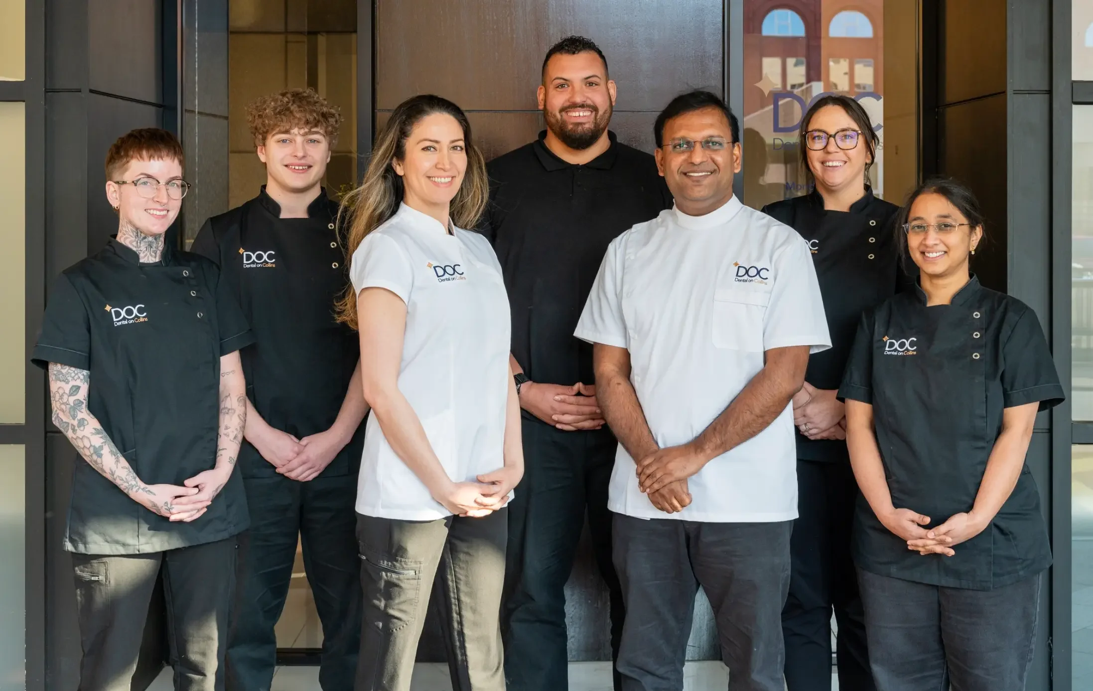
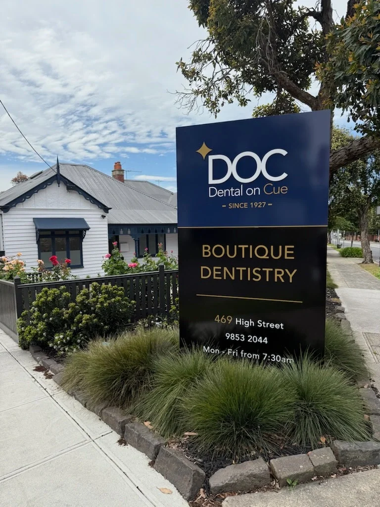
Dental practices. Signage, uniforms, appointment cards and a website all have to feel like one practice, and the mark has to look calm at small sizes on paperwork patients read while nervous. There is more in branding for dental practices.
Wellness and pilates studios. These brands lean on typography and tone more than symbol, and the mark is applied to textiles, printed in low-contrast colourways and set very small on product. Fine detail disappears in all three.
Health product brands. The mark has to sit on a label a few centimetres wide, beside mandatory information, and still read on a shelf from a metre away. It also needs a version that holds on a retailer's white grid.
How the work runs
Every logo design Melbourne project runs the same four stages, on a fixed schedule, with a clear list of what you owe at each point. The dates hold when your feedback comes back inside two business days.
Stage one, Discovery
Thirty to forty-five minutes, no charge, usually within a week of you getting in touch. We cover what the business does, who it serves, what is failing about the current mark, and every place the logo has to appear. Bring an honest list of applications, including planned ones. If it is a fit, a deposit books your dates.
Stage two, Strategy
Week one. A working session on positioning: who you are for, who you compete with, and what you want a person to think in the three seconds before they read anything. The logo type, colour territory and typographic tone are decided here. If two people own the business, both attend, because a disagreement found at concept stage costs a week.
Stage three, Design
Weeks two and three. I present two distinct routes, each a considered answer to the agreed strategy and shown in real applications rather than floating on white. You choose one. Foundation includes one round of refinement to final on that route, Transform includes unlimited revisions. Colour, typography and the full suite are built out around your chosen route.
Stage four, Launch
Week four. Final files, every lockup, every format, the colour values and the guidelines document, in one organised folder. Ownership transfers on final payment. You also get a handover call and a written list of what to send each supplier, so everyone receives the right file first time.
When to replace a logo, and when not to
There are five honest reasons. The business changed and the logo still describes the old one. You are opening a second location and the identity was built for one shopfront. The name no longer matches the offer, common when a solo practitioner becomes a clinic. The mark fails in applications you now need, such as uniforms, vehicles or an app icon. Or a friend made it before there were staff, and nobody can find the source files.
Any of those justifies the spend, because each one removes friction that is costing you every day.
Then there are the cases where a new logo will not help. If enquiries have dropped, the cause is usually demand, pricing, location, availability or the simple fact that not enough people know you exist. A logo cannot fix a marketing problem, and replacing it feels productive while changing nothing. Work through five signs a logo has stopped working and see how many apply before you commit.
Frequently asked questions
-
Expect four bands. Logo generators and template marketplaces sit under a few hundred dollars. Productised sellers run roughly $300 to $1,500. Independent studios and small agencies sit between $2,500 and $12,000, and full agency brand programmes go higher. My work starts at $3,500 for Foundation, delivered in four weeks, which includes strategy, the full logo suite, colour, typography and a complete guidelines document.
-
Four weeks for Foundation, from the strategy session through to final files. Five to eight weeks for Transform, because market and competitor research sits at the front and stationery and packaging sit at the back. Multi-location and franchise work runs to an agreed schedule. The timeline holds when your feedback comes back inside two business days at each stage.
-
Two, and both are real. Each is a considered answer to the strategy we agreed, rather than a wall of options that makes the decision harder than it needs to be. Each route is presented as a primary mark with at least one lockup and an indicative colour direction, shown in real applications instead of floating on a white page, so you can judge how it behaves in use.
-
Vector source in AI and EPS, SVG for web, PDF for print, PNG with transparency and JPG for platforms that will not take a transparent background. Every lockup is supplied in full colour, one colour and reversed. You also receive a favicon built at sixteen pixels, your colour palette in HEX, RGB and CMYK, the typography system and the brand guidelines document.
-
Yes. Full ownership of the final logo and all source files transfers to you on final payment, in writing. You can use the mark anywhere, hand the files to any printer, signwriter or developer, and change designers without asking my permission. I retain one thing only, which is the right to show the finished work in my portfolio.
-
Yes. The studio is Melbourne based and I work with clients across Australia. Strategy sessions run over video where travel does not make sense, and every deliverable is digital. Most projects run identically whether you are in Brunswick or Brisbane. If the business has a shopfront or a fit-out that matters to the identity, seeing it in person helps, and I will say so.
-
A logo is one mark. A brand identity is the system around it: the full logo suite, colour palette, typography, imagery direction, layout rules and the guidelines that keep it consistent once other people start using it. A logo on its own cannot make a website, a uniform, a sign and a social post look like one organisation. The system does that.
-
It is rare, because the strategy session settles the direction before design starts. If it happens, we return to the strategy, work out which assumption was wrong, and I present a fresh round at no extra cost. That has to happen at the concept stage, not after you have chosen a route and been through refinement on it.
-
If you are pre-launch, trading from one location and mostly found online, a logo suite with colour, typography and guidelines is usually enough. If you have staff in uniform, a shopfront, printed collateral, product packaging or a second site coming, you will assemble a system anyway. Buying it as one considered project costs less than buying it in pieces.
-
A short call, then your answers in the strategy session: who you serve, what you sell, who you compete with and what you want people to think. Bring any existing files you still have, a list of every place the mark has to appear, and your trading name exactly as it is registered. A deposit books your dates in the calendar.

Ready to build a brand that performs?
Let’s create something bold, strategic and in harmony with your business goals.