GROWING YOUR CONFIDENCE
The brief required rebranding the practise with a clear strategic focus on elevating the “Garden” concept into a true point of difference. Rather than leaning into another generic green dental identity (especially with a competitor one block down the road), the new brand positions the practice as a zen & premium dental practise.
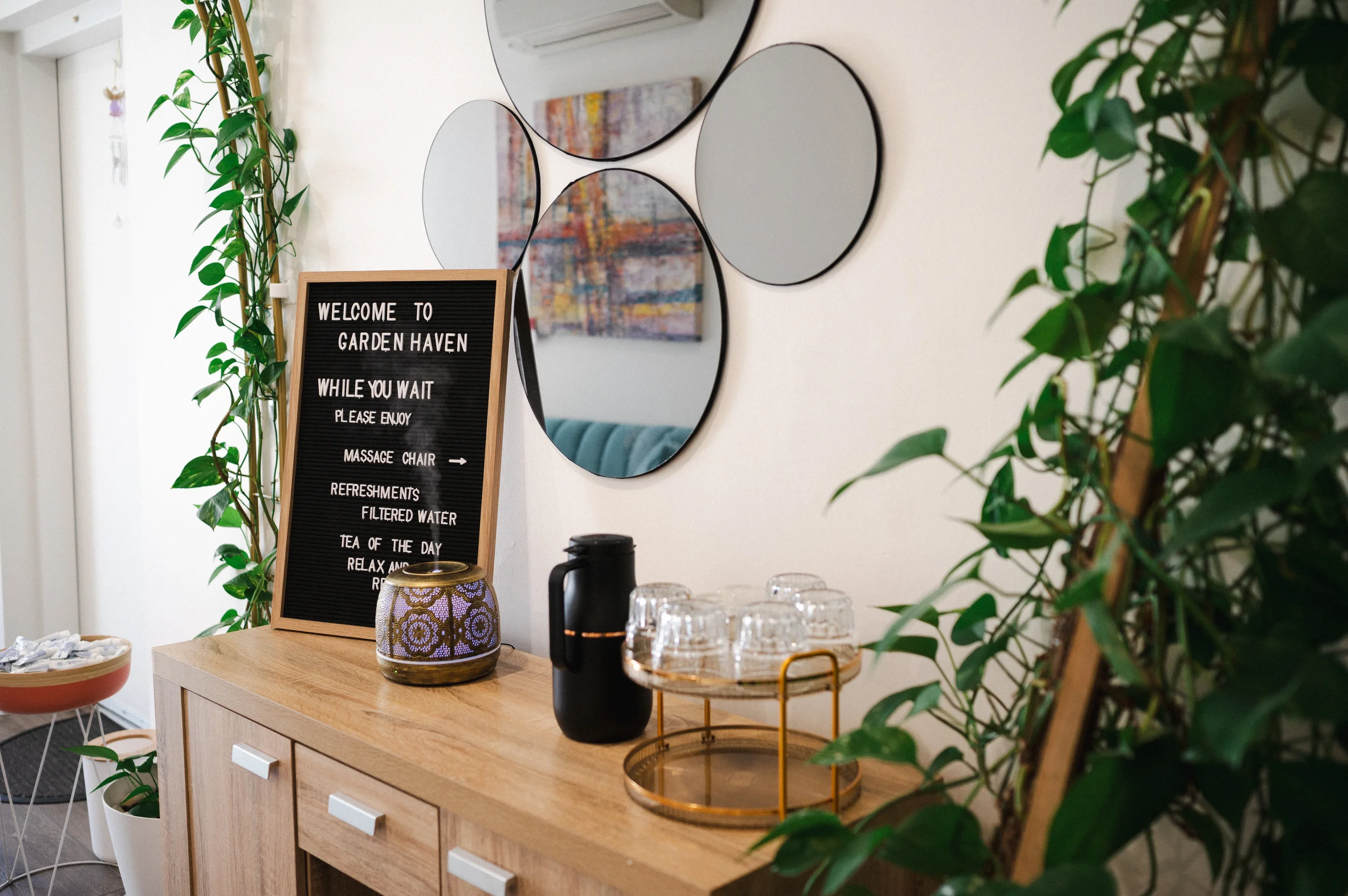
Soft botanical cues, refined natural tones, and considered typography were used to create a relaxing yet sophisticated atmosphere, aligning with the expectations of the Albert Park audience. The result is a brand that feels inviting, confident, and intentionally understated, standing out not by being louder, but by being more thoughtful and elevated.
- Full Rebrand -

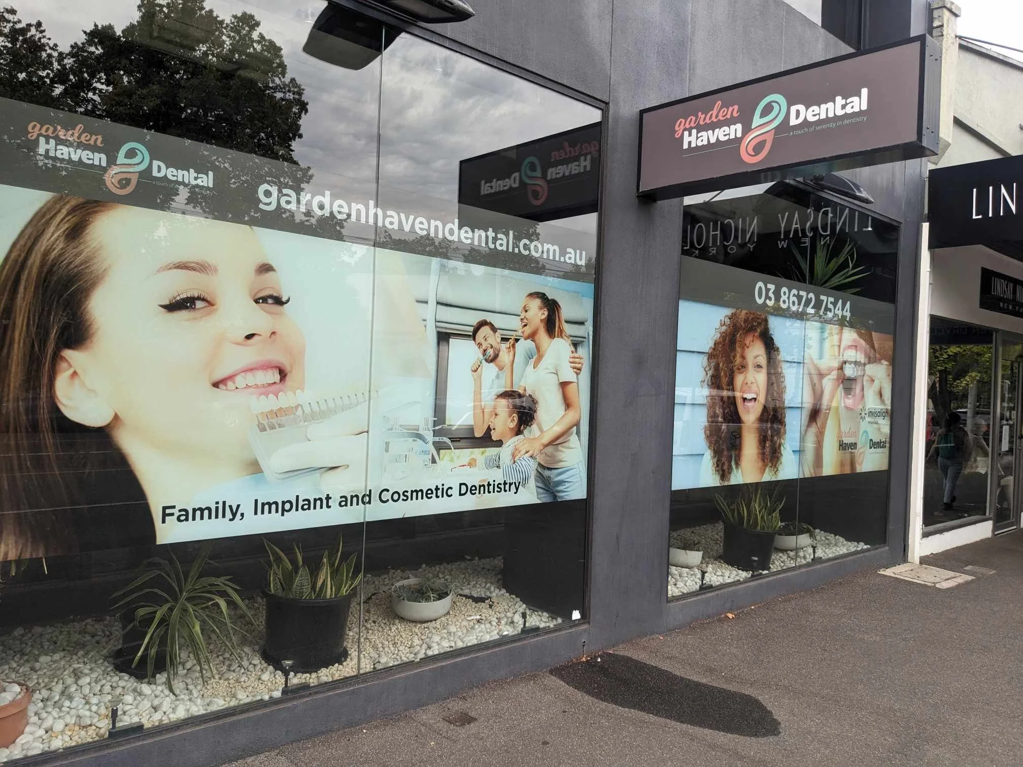
Before

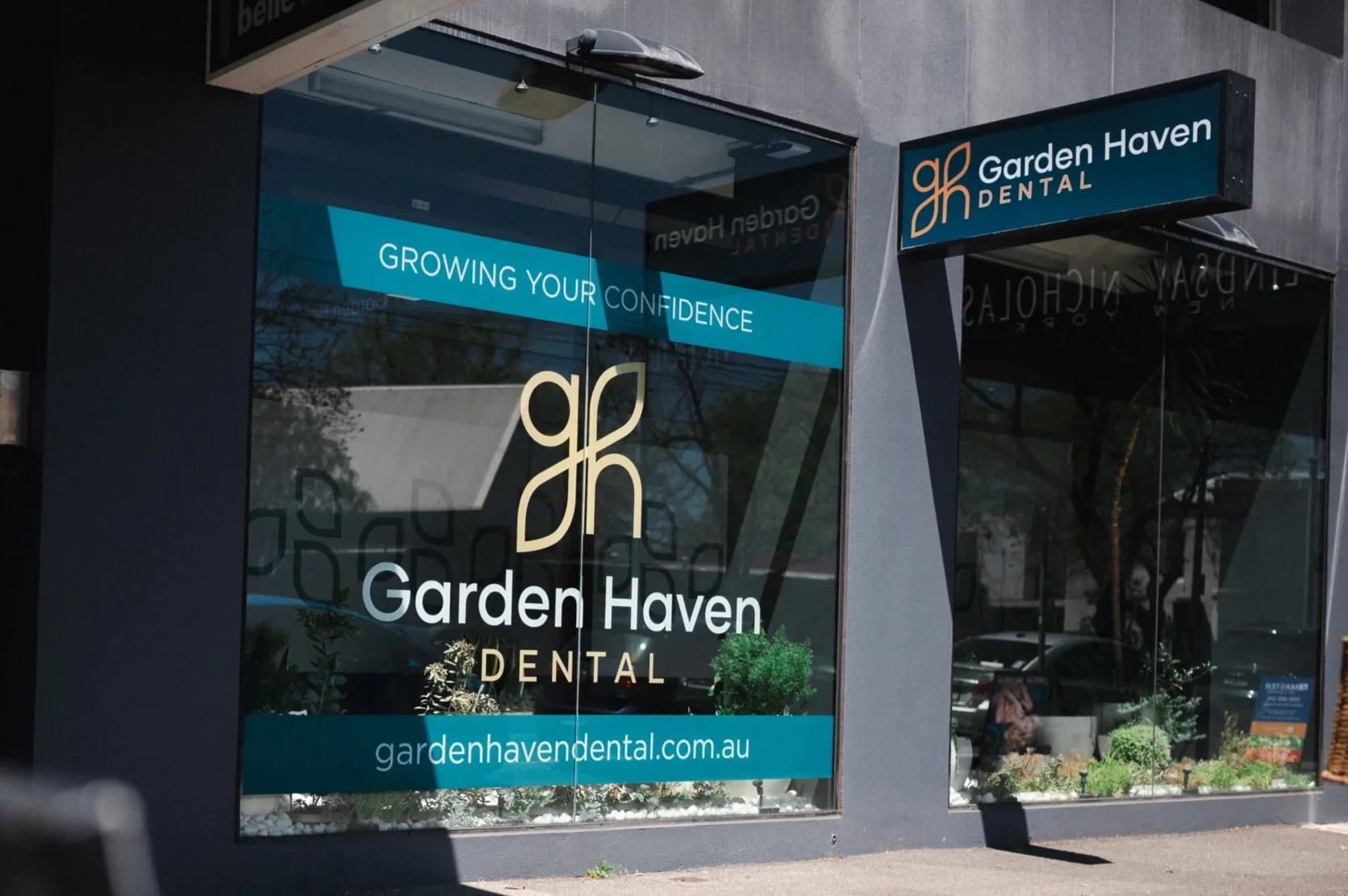
After
LOGO
The logo is a custom lettermark, formed from small-caps G + H, representing Garden and Haven. The characters are carefully constructed and perfectly balanced to interlock in a way that naturally forms a modern, leaf-like symbol = subtle, intentional,
and instantly recognisable.
Rather than relying on literal botanical imagery, the symbol uses negative space, symmetry, and proportion to suggest growth, calm, and quality in a more refined way. This abstraction elevates the brand beyond typical “green” dental logos, allowing the garden concept to feel premium, architectural, and timeless rather than decorative or trend-driven.
Finished in gold, using the Gilmer typeface, the mark introduces a sense of quiet luxury and confidence, while the softness of the form maintains a welcoming, calming presence. The result is a symbol that feels both organic and considered, perfectly aligned with the Albert Park audience and the brand’s positioning as a premium yet relaxing dental experience.


